Optinly
Email pop-ups aka email collection pop-ups are being widely used by websites and eCommerce stores to grow their email list (and for a number of other reasons). In fact, it’s no wonder that 7 out of 10 websites use email collection pop-ups as they’ve found them to be extremely effective.
Now since you’re here, I could only think of two definitive reasons,
- You’ve understood how important email pop-ups are and you wanted to check out some of the best pop up examples.
- Your email pop-ups are not doing quite well and you want to tweak your pop up design & techniques.
That’s great because I’ve personally handpicked some of the best email pop-ups around for you. We’ll be looking into various factors like the pop-up design, why the popup was used, how it helps with conversions, the type of popup trigger used and more.
So, let’s get started! We’ve got no time to lose – every second delayed is one potential website visitor let off the hook!
15 Best Email Pop-up Examples from Websites
1. Tommy Hilfiger
We’ll start off with the well-known brand Tommy Hilfiger.

What’s great about this email collection pop-up is
- Tommy Hilfiger has used its brand colors brilliantly by collaborating it with the pop-up design and the pop-up text – the borders have red & blue color, not to mention the capitalized text colors.
- The text within the popup template – giving something extra to the audience to satisfyingly convince them in case the 20% off trick doesn’t work out.
- Tommy Hilfiger has used this as a welcome pop-up – the instant delight for visitors, hoping to grow their email list and possibly make a sale out of it.
That’s a fine example for an email pop-up – brand resemblance blended with witty copy lines.
2. Under Armour
Under Armour, a renowned health & fitness eCommerce store has also used a popup form on its webpage. And here it is,

This email pop-up of Under Armour greets users with a promising line “Everything here is built to make you better”. Under Armour being a health & fitness store, one couldn’t think of anything better (“Did you smell what the Rock is cooking?” could have been better). The pop-up has a dotted black background which makes it easy for users to read the text. And the lines that follow clearly explains to the website visitor what he/she would get if they sign up.
The popup form is simple and to the point – no extra stuff whatsoever.
3. Gucci


It seems that Gucci is running a popup campaign for “Father’s Day”. And what’s even more clever is that you get this popup when you visit the men’s section. Apparently, Gucci has used page based targeting options.
The popup is subtle by appearing at the lower end of the screen and makes sure it does not disrupt the user experience. A brilliant CTA “Shop the Perfect Gift” makes the occasion even more interesting to the store visitor.
Gucci – A targeted subtle purpose serving popup with zero annoyance factor.
4. Optinly Floating Sidebar Popup
Since we’re talking about some of the best popup examples, I thought why not bring in Optinly’s templates! Here’s one for you


This fully customizable popup form is an ideal example of how a floating sidebar email collection pop-up should be. The popup is simple with a clean typography, giving you the option to explain your purpose in a few lines. Its aesthetically pleasing alignment and the design patterns below make this popup a must-have collection of yours.
5. Dolce & Gabbana

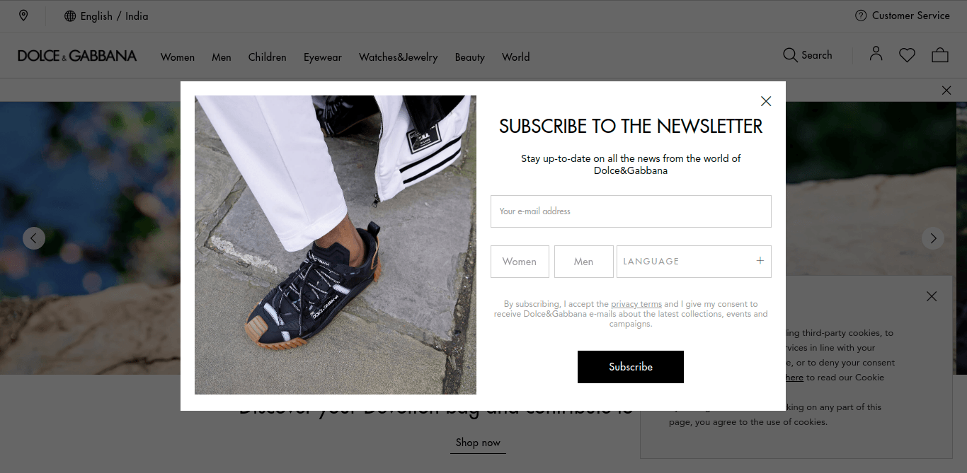
Dolce & Gabbana has used a welcome popup that’s straight to the point – you do this, you get this! Also, the popup form has boxes asking for gender and language which D&G will be using to send personalized newsletters. Any die-hard fan of D&G wouldn’t fail to fill this email pop-up that’s simple and to the point.
6. Nike
The famous sports apparel giant has used an exit-intent popup in its store. Lets’s see how well the popup form is

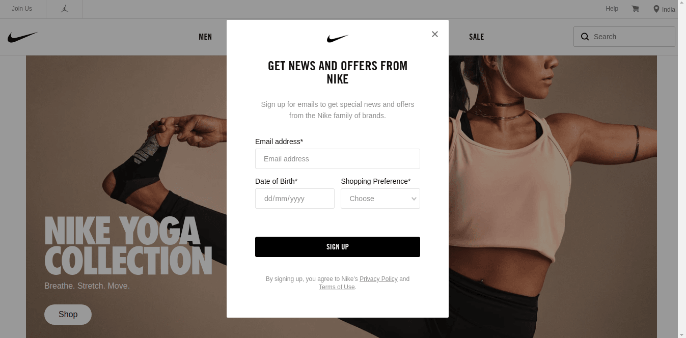
Nike displays this popup when a visitor is about to leave the site, using it as a last-minute window to capture the email address. The popup form is simple and has personalization categories including DOB (maybe Nike wants to greet/send special offers on your birthday) and shopping preferences.
This popup serves the incase factor very well – just in case you do not want to shop now but you will in the future.
That’s one of the classic example of a best email pop-up.
7. Casio
Casio is known for its diverse range of products right from watches to calculators including musical instruments. Here’s how Casio has used email collection pop-ups on its website.


While I was surfing through the “Casio Edifice” section, a few seconds later, I had the above email pop-up appear in front of me. And later, when I was surfing through the “Protrek Watches”, this time I had a different popup form appear.

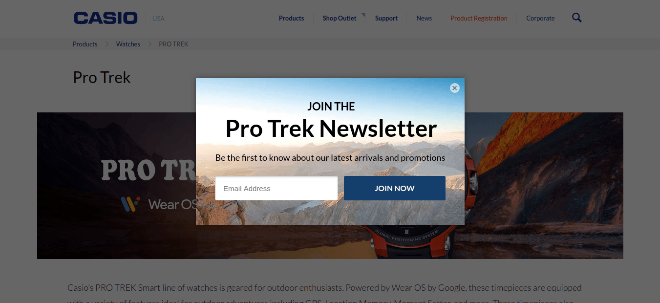
Apparently, Casio has used timed delay popups + page-level targeting to make different popups appear on different pages. What’s even more interesting is how Casio has differentiated the purpose of the watches using images – the Edifice popup has a city-themed image behind (as Edifice is best suitable for workplaces) and the Protrek popup has a mountainous background (meaning Protrek is best suited for outdoors). And as for the pop-up design, Casio has kept it simple and to the point – masterstroke!
8. The New Yorker
Moving from eCommerce stores, here’s how a renowned digital magazine has used email pop-up forms on its website.

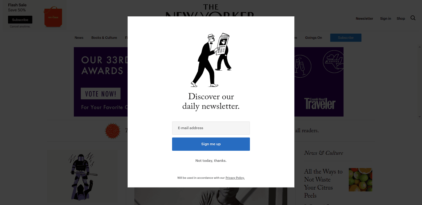
The New Yorker, on its homepage has used an exit-intent popup to capture visitors at the last moment. And as for the popup, the caricature of a man reading a newspaper clearly indicates what the website is all about.
The New Yorker – A pretty popup with only what’s needed!
P.S. You also get to see another popup serving the same purpose when you reload the webpage.
9. Optinly Floating Bar Popup
Speaking of The New Yorker and its attempts to capture the visitor’s email address, here’s an email collection pop-up from Optinly that would do the same.


An alternative approach to the same purpose. Assume this popup appearing at the top of the screen when visitors scroll down the web page. Like the New Yorker popup, this email collection pop-up form is to the point. And the text “Join 1 Million+ Monthly Readers” is sure to kindle action among visitors. As for the pop-up design, it’s simple, clean and visually appealing.
10. Wix
Wix, the famous website builder has used a popup on its blog section. Though not the exact email collection pop-up type we were speaking about, this Wix popup is one of the best pop-up examples you shouldn’t fail to look.

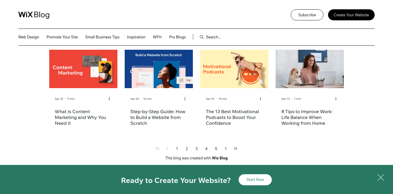
Wix has come up with a subtle floating bar popup at the bottom of the website. What makes it stand out is the color of the popup. The webpage has several blog posts and comes with banners of vibrant colors. And the turquoise green floating bar at the bottom makes the entire page even more vibrant. Put in a few words, Wix has proven how important the color factor is when it comes to pop-up designs.
11. Search Engine Journal

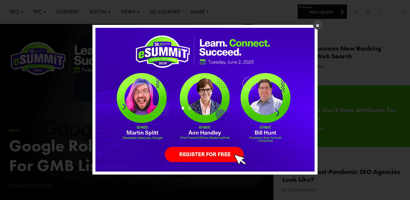
It seems that Search Engine Journal is about to conduct a webinar and it wants its users to register for the same. SEJ has used an exit-intent trigger here. The website popup has all the necessary details of the event with it – right from the date to who’s going to be there.
Search Engine Journal has nailed its popup, proving it to be one of the best popup examples for an about to happen event.
12. Pitch Ground

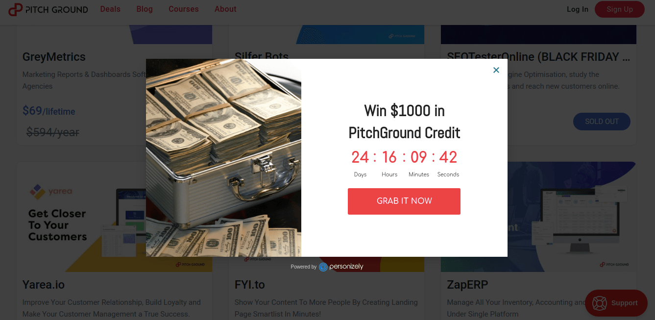
Though Pitch Ground uses a lot of website popups on its site, this is the one that has stood out. This Countdown Timer Popup here uses an exit intent trigger. Countdown Timers are used to create FOMO among website visitors and using it right when the website visitor is about to exit creates more urgency.
The popup copy says “Win $1000 in PitchGround Credit” and the “Grab it Now” CTA text makes this popup irresistible.
13. Neil Patel
Spin the wheel popup is one of the best gamification popups most websites fail to use. Here’s an example of a website where spin the wheel popup is at its best.

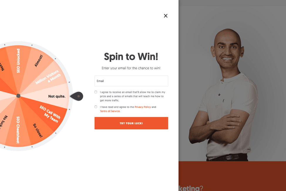
The color of this spin the wheel popup is designed based on the website’s theme which helps the email pop-up to blend in. And the text “spin to win” tells users clearly what they should be doing. This email collection pop-up is clean, simple and is one of the best pop-up designs I’ve ever come across.
P.S. Check out some of the best spin the wheel popup plugins available in 2020.
14. Chanty

Chanty, a team interaction tool has taken email capturing to a whole new level. This gif email collection pop-up has more of a hypnotic effort on the users asking them to choose wisely and the figure right next to it is totally cool. If it were me, I’d give in the first minute. What about you?
15. Optinly Resouce Giveaway Popup


Here’s an excellent resource giveaway + email collection pop-up example. The popup first kindles interest amidst the visitor by mentioning a sum of money he/she earned the previous month. Going a further step ahead, the popup says that the visitor can get access to all his/her techniques by downloading the eBook provided they submitted their email address. It’s a fair trade and a kill!
P.S. Optinly has 75+ inbuilt email pop-up forms. Check them out now!
We’ve come a long way from the start. We’ve seen some of the best email collection popup examples used by eCommerce stores, renowned magazine websites, a few marketing websites and of course, a few in-house best popup-design examples. What’s to be observed and understood is how the design factors, right from the colors used in the popup to the text within, influence the user in taking a decision – whether to give up their email id or not. And that’s something you have to carefully learn and master if you want your popups to do the job.
The average conversion rate of an email pop-up form is 3%. But, those are just numbers. When you start designing popups the super cool way, who knows, your email pop-up conversion rate could shoot up to 25% or even more.
So, it’s time you start designing some good pop-ups/pretty popups (however fancy you want to call them) that does some serious conversions!