Optinly
Popups are an effective way of intensifying your WordPress websites. Following proper pop up best practices with the right WordPress pop up message can create a huge impact on your visitors.
Starting from a page pop web design to email pop up best practices , every single one of the popups have its own way of grasping visitor attention. There are different types of pop ups, each with its own set of premier qualities.
This article will bring out the top seven methods of using popups on your WordPress websites without disturbing the visitors. Some of the best popup plugins in the market have a long history of intensifying visitor experience, the best example that can be given is cm pop up banner for WordPress. The progress made by popups in recent years for any WordPress website is incredible.
How to make a pop up on WordPress Website? How to add pop up window in WordPress? How to measure the effectiveness of an implemented popup? All these questions must be answered by the popup plugin you select for your WordPress website.
The best popup builder for any WordPress website must satisfy all the requirements of the digital market. Pop up web design initiated during the early stages of a website development will enable you to prepare for the best results in the future.
Pop ups not only increase visitor engagement rate in your website but also provide valuable assistance in growing your email list. A quality email list that increases conversion rate and customer acquisition rate. Like a cm pop up banners for WordPress, you need to have something solid to progress your website.
Identifying the best practices for any popup is the only way you’re going to grow your list successfully if you have a website popup strategy that converts.
Different Types of Popups – How effective are they?
There are different types of pop ups that can be used to increase conversion and visitor engagement. Selecting the right one for your WordPress website is all that matters. Along with choosing the right plugin, perfecting the pop up best practices, you need to know the right type of pop up for making a huge difference in your WordPress website.

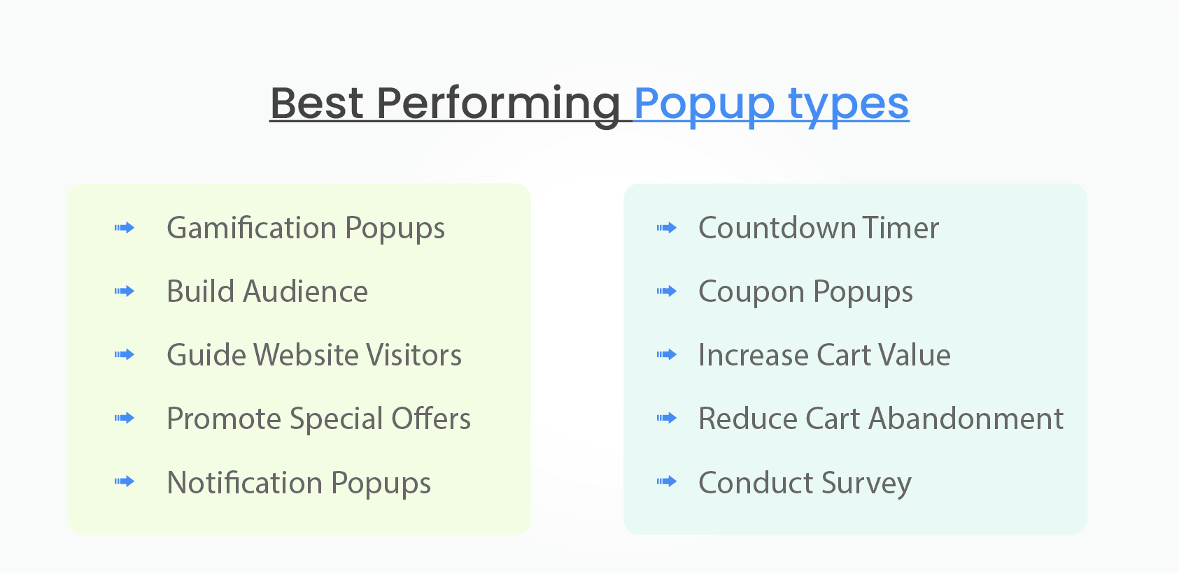
Every single pop up is equipped with its own unique features that assist in the process of business growth. Identify the pop up features that will work for your and embed it in your WordPress website.
Gamification Popups
Now, who would not love a fun element here and there. Gamification popups are the one to go for. These pop up web designs provide a fun element and increase conversion and engagement rate on your WordPress website. This allows you to interact with your WordPress website visitors in a unique way.

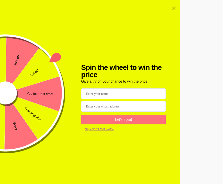
An ideal popup for grabbing the attention of first time visitors. This pop up web design will increase visitor interaction on your website.
Audience Building Popups
Deliver unique forms through eye-catching and attention-grabbing popups. These types of popups will play a vital role in increasing your email list. Not only will it increase the number of email lists you have but also will deliver better quality email leads.

With the right WordPress pop up messages, these types of popups can have a great engagement rate. With an eye-catching design and the right message, there is no doubt about these popups building a strong audience base.
Guide Website Visitors
Why can’t you use a popup for guiding visitors to your WordPress websites?
Guiding through the website doesn’t mean helping the visitor navigate through but letting them know about the next big step or a big announcement. This will act as a reminder as well as a guide for the visitor to keep track of your website updates.


These popups are ideal in letting the visitor know about your future plan or roadmap and converting them into a loyal customer or user. But make no mistake these pop ups are crucial and need to be used at the right place of page pop web design.
Special Offer Pop Ups
As the name indicates these pop ups are effective. They appear and let the visitor know what is “happening” on your website. For example, a WordPress website that offers certain downloadable products at a special price can elevate their sales through these popups.
When it comes to spreading the word about special offers, there is no alternative to this popup in the digital spectrum. They get the work done without any hassle.


They make the best out of every situation and will let the visitors know the deal they are going to get. They can be displayed on a full screen or in any particular part of the screen.
Notification Popups
How can you let the visitor know something important that is going on in your website? The answer is notification popup.
They are ideal popups when you want your visitor to know about the special ebooks, upcoming major events or something that is huge. These popups instantly grab visitor attention and let them know about the major happenings in your website.

These popups can be placed anywhere on your webpage and it will attract visitor eyes as soon as it pops up. Notification popups are among the most used email pop up best practices. This will indulge your visitors with new information and also act as a reminder.
Countdown Timer
Yes, you guessed it right. A popup to induce a sense of urgency among your visitors. When your website is hosting a huge discount sale. Then this is the popup to be had, it will let the visitors know about the invaluable sale while nudging them towards the purchase. Make use of this popup whenever there is a large sale or a huge event approaching. It will cause a high drive towards the target event.
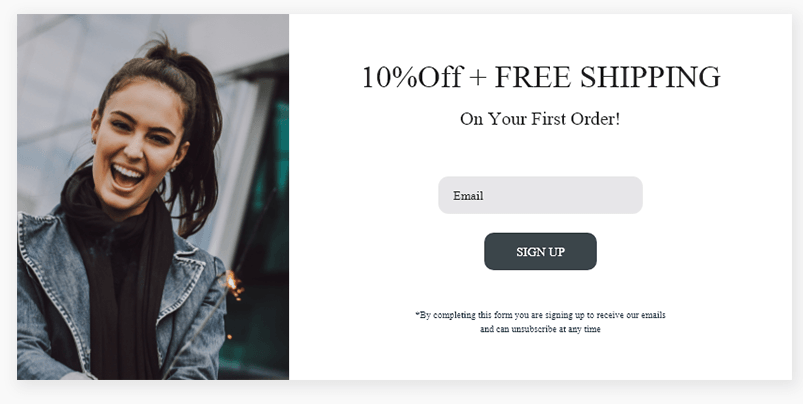
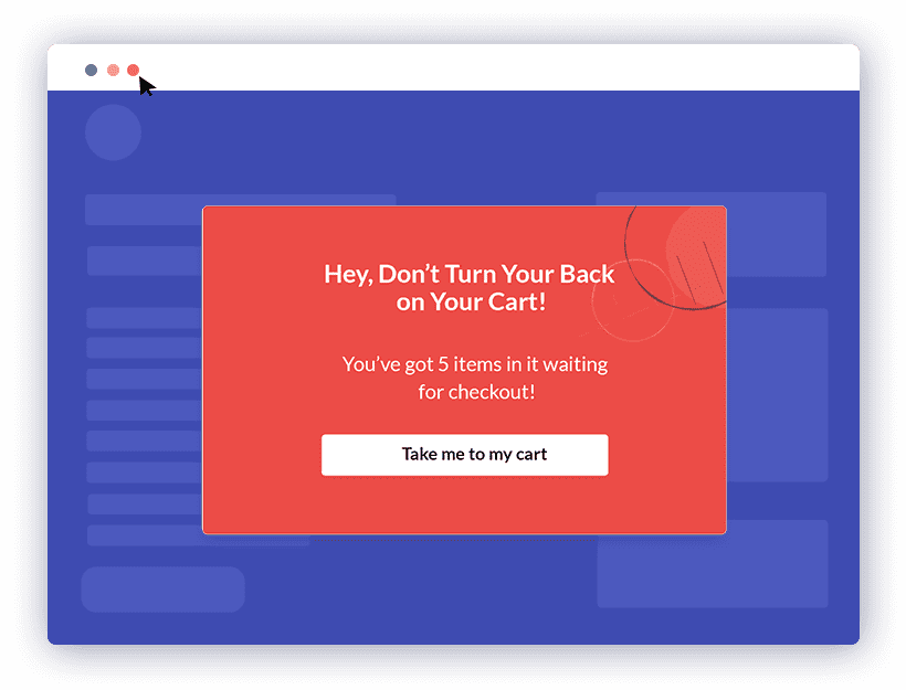
Popups to reduce Cart Abandonment
Cart abandonment is a huge concern when it comes to eCommerce, so your solution to reducing the cart abandonment rate is through this popup. Typically this popup will come alive when a customer is a couple of minutes away from abandoning the cart.


Similar to the above image you can convey a message to the customer about a special discount when they complete the purchase. This will push the customer to complete the purchase. This type of popups have a strong proven track record of reducing cart abandonment
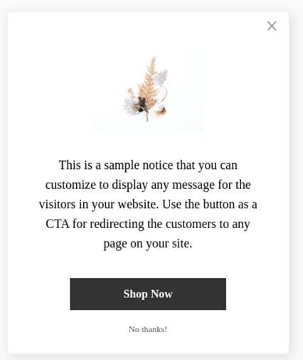
Fullscreen Overlays
These full screen popups are sometimes frustrating but when used at the right time, well, there is no other popup that can match this popup’s effectiveness. These pop ups with the right message will grab the customer or visitor attention completely.
For example, if you are launching a new product and want all the visitors to your WordPress site to know about the product, then this is the popup that can make it happen. Yes, these pop ups can be irritating sometimes, so make sure your close popup button is clearly visible to the visitor.
Make these pop ups count every-time they are displayed with the right message. A full screen popup will enable you to deliver the right message across without any hassle. Have a clear goal while using these popups.
Timed Popups
Popups that will be delivered when a visitor spends a certain amount of time on your WordPress website. This pop up can be used when you want to give the visitor additional information about your website.
For example, a visitor who spends about five minutes on the homepage will get an idea about the website. After five minutes you can use this popup to give the visitor something special, like ebooks, special event entities and things like that.
These timed popups are effective and will easily grab audience attention. The visitor will be definitely looking at the screen when this popup gets displayed.
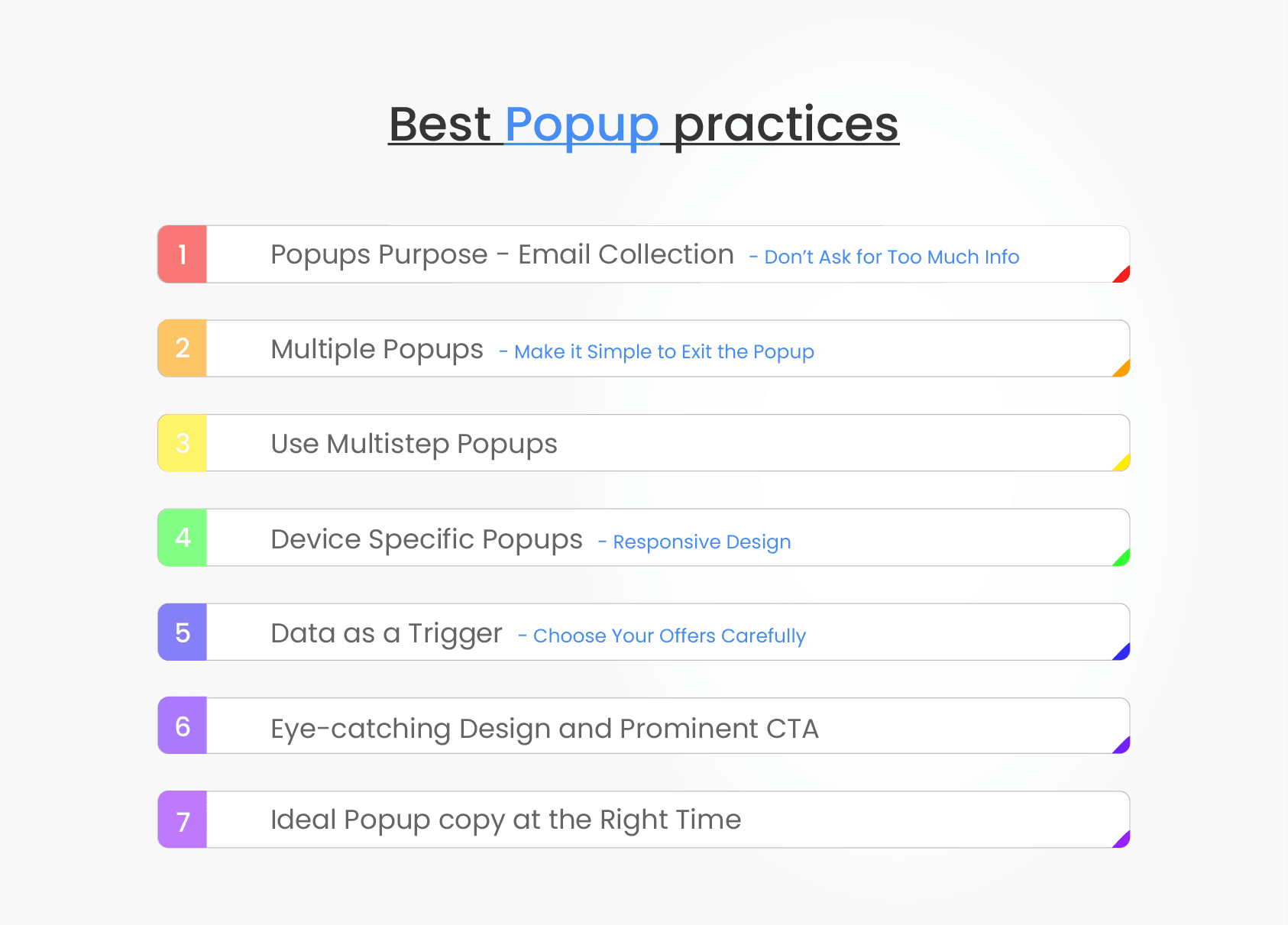
7 Effective Popups Practices on your Website

Every single popup is unique and has a different aspect when it comes to delivering the right message to the user. Therefore selecting the best practices for each one of them is invaluable.
When you select an email pop up best practice, it must be followed to every last letter. But the same practice will not be suitable for newsletter best practices. Therefore selecting the best practice that makes the popup more effective will inevitably make them more valuable.
1. Purpose of a Popup – Email Collection
It’s no secret that most marketers use website popups with list building. And it makes sense. After all, that’s what website popups are mostly used and known for.
Whenever you find yourself on the side of the majority, however, it is time to pause and reflect.
To use website popups to their full advantage, you must think beyond list building (the old way) and, in addition, use popups to help website visitors.
When you get the attention of the people you’re trying to convert, you need to make it as simple and fast as possible for them to do so. The number one rule for your forms is to keep it short and sweet.
As you’re creating your forms, be sure you’re only asking for the information you truly need. If you can get away with just asking for a first name and email address, then let that be it.
Most website popups you find today are designed with only one or two fields, so users aren’t dissuaded from filling it out.
2. Multiple Popups – Keep it simple to leave
As mentioned previously, most marketers use website popups to grow their list and, moreover, show it to all visitors on all pages of their website. The problem, though, is, in doing so, they ignore where each visitor is in the buyer’s journey.
A returning email subscriber sees a popup asking for their email (again). A return buyer sees a popup promoting a product they bought on their first visit. The list goes on.
A better approach, we’ve found, is to make one popup for each stage of the buyer’s journey. That way, you can move each user down your funnel, from a visitor to a subscriber to a buyer and beyond.
The buyer’s journey varies from market to market, of course, so for simplicity, think of the buyer’s journey in three stages:
First-time visitors: These are visitors that are not on your email list;
Returning subscribers: These are subscribers that are on your email list; and
Returning customers: These are subscribers that have bought from you.
Bottom line: meet users where they are in their journey and use targeted website popups to show them the message that’s needed to move them down to the next stage.
You want the visitors who see your website popups to convert, but it shouldn’t be at the expense of your reputation. Some brands use shady tactics like not including an X button or hiding it.
Do this, and you risk visitors leaving — never to return again.
So don’t use this irritating method to try and force your visitors to comply. You’re better off making the X button large, so it’s visible and easy to click on a small smartphone screen.
You can also have a “No, Thank You” button they can choose. If you’re worried about non-conversions, you can use psychological tricks to make visitors second guess clicking away.
For example, if you sell weight loss supplements, you can give two options — “Yes, Sign Me Up!” or “No, I’m happy with my current weight.”
In many cases, the people visiting your site aren’t okay with their weight — that’s why they’re there. So this may play on their insecurities, making them more susceptible to signing up.
But be careful about your negative reverse psychology. It can backfire if you come off as sleazy or rude.
3. MultiStep Popups
If you’re like most marketers, you want to know as much as possible about your subscribers.
After all, the more information you have, beyond a name and an email address, the easier it is to send better, more personalized emails, and therefore, drive more clicks and conversions.
The problem, though, is additional fields add friction… and friction means fewer options and fewer conversions.
Note: We found from our research that popups with two input fields convert better than popups with three input fields by a whopping 206.48 percent.


So, does that mean that lead enrichment and high conversions need to be mutually exclusive? The answer, if it weren’t obvious, is a no—if you’re using multistep popups.
If you’re unfamiliar, multistep popups are email popups that capture the visitor’s email in the first step (or form), and then collect more information in the second step such as gender, preferences and more.
Note: The best part is, popups with a second step see a staggering 76 percent of its subscribers input more details.


With that information, you can send targeted emails based on the subscriber’s interests, thus increasing the likelihood of them becoming a buyer.
4. Device Specific Popups
Marketers know mobile browsing has overtaken desktop, so it makes sense to want to convert as much of that traffic as possible into leads, using a website popup (provided it doesn’t hurt the user experience).
But there’s another reason to show mobile-specific popups, and that’s to change the popup’s call-to-action (CTA) due to having device-specific goals.
Let me explain with some examples. Suppose you manage an online retailer and want to get more email subscribers. On desktop, you might do that by using an exit-intent popup.

On mobile, however, you might want to avoid intruding on visitors with an exit-intent popup and ask them to follow you on social media instead.
Or, let’s imagine you’re a SaaS. On desktop, you might ask new website visitors to start a free trial, whereas, on mobile, you might want visitors to book a demo instead. Why? Because your software might not be mobile-friendly, and asking for free trials on mobile would create a poor user experience.
In fact, this is exactly what many successful companies do. On mobile, you want visitors to book a free demo. To do that, you show a teaser, inviting visitors to learn more about our product, before inviting them to book a free call.
There’s more to optimizing mobile conversions than adding a website popup. Conversions matter, of course. But what happens after is more important.
Responsive designs are a must for all the popups.
Why is this essential? Because it ensures your website popups can be viewed on any device — desktop, tablet, or smartphone. The popup will change based on the size of the screen detected. Optimizing for mobile will also help your website rank higher in Google and other search engines.
When you create a new popup, make sure to test it on different devices to see how it looks and behaves.
5. Data as a Trigger
If you’re using website popups, you might have encountered a common challenge: knowing when to show your popup(s).
While it’s easy to default to a timed or scroll trigger, the best trigger, in our experience, is to show a popup based on a visitor’s real-time behavior, such as:
- Watching a video
- Adding an item to their cart
- Exceeding a predetermined basket size
- Visiting a certain category page and more.
The best part is, if you use Google Tag Manager, you can customize a trigger based on any Data Layer on your website.
We know from split testing that the optimal time to show our slide-in popup is when a reader has scrolled 30 percent of a page. To make our popup more personalized, though, author-specific campaigns use sitedata features.
What ultimately sets apart high-performing website popups from the non-performing popups is the offer. Let’s say you get your website popup in front of a targeted audience at the right time.
If the offer doesn’t pique their interest, then you’re better off not having any popups.
This is where A/B split testing will come in handy. Experimenting with your offers will help you identify which offer the best results.
The idea is to choose offers that relate to the visitor and their intent. Why are they on your site? If they’re shopping around, then you can capture their attention with a discount code or free shipping offer.
On the other hand, if they’re there looking for information, then you can offer a free e-book download or case study.
6. Eye-catching Design and Prominent CTA
“Everything is designed. Few things are designed well.” No truer is this than with popups.
Most are, to put it mildly, forgettable, and leave little to be desired. But with thousands of sites competing for attention online, that’s only a good thing, because it means there’s a better chance of standing out.
There are some brands in the digital space that stand apart when it comes to popups designs. When the popup is displayed on the homepage, the interface must be effective and elegant in a manner that does not disturb the visitors.
While it’s nice to have a popup with all the bells and whistles, a minimalist design can convert just as well, if not better, than a well-designed popup.
To summarize, then, you can and should use a nice popup design—if you have the means to do so. Using a floating image, as Real Coffee does, can differentiate your popup from your competitors’.
If you’re not a designer, however, there’s no harm in opting for a simplistic design, provided, of course, you follow the most important best practice of all…
Your call-to-action is one of the primary factors that’ll determine whether or not your visitors convert. CTAs are words that tell the prospect what to do next.
For example, “Shop Now,” “Order Today,” “Sign Up Here,” and “Buy Now!”
If you don’t include a CTA or don’t have it so it’s highly-visible, then you risk them not completing the desired action. This is why you’ll find popups with large yellow, red, and blue buttons with large CTAs.
It immediately catches the visitor’s attention and ensures they know how to complete your offer. Make your CTA stand out by giving it a contrasting color.
7. Split Test Every Website Popup Campaign
Whether you have one popup or ten popups, you need to be sure you’re experimenting with them all. This is the only way you’re going to improve the results of your campaigns.
You do this by setting up two different popups targeted at the same audience (i.e., new visitors or visitors shopping for shoes). Each website popup should be similar with one unique difference, such as a different headline, copy, or offer.
Only change one thing at a time, so you’ll know what made the popup perform higher than the other.
To Wrap it all
There’s more to popup than using power words or removing input fields. To maximize popup conversions, you must consider the buyer’s journey, user to user, from beginning to end.
If you do that and continue to improve with each iteration, over time, you will turn more visitors into subscribers and, above all, turn subscribers into buyers and more.
Then you need to put these best practices to use today. At least this way, you don’t have to worry about learning a coding language. Just drag and drop the elements you want in your popup and fill in the text.
It’s quick and easy to get your website popups up and running within minutes.