Optinly
“Pop-up designs play a huge role when it comes to conversion rates. In fact, your pop-up design and conversion rates go hand-in-hand.” You might blatantly disagree or even argue over this statement but, that’s the cold truth fact – it’s your popup form design that makes your visitors like “Oh wait! Let me see this!” and paves way for a conversion.
In order to make sure that our strong faith in pop-up designs is true, we came up with a self-made experiment. We chose two website popups A & B (popup A had all good design aspects and popup B was quite the opposite) and created two different exit popup campaigns targeting the same page. The popup campaign with the “Website Popup A” ran for a week and the popup campaign with the “Website popup B” ran for the next 7 days.
campaign with the “Website popup B” ran for the next 7 days.
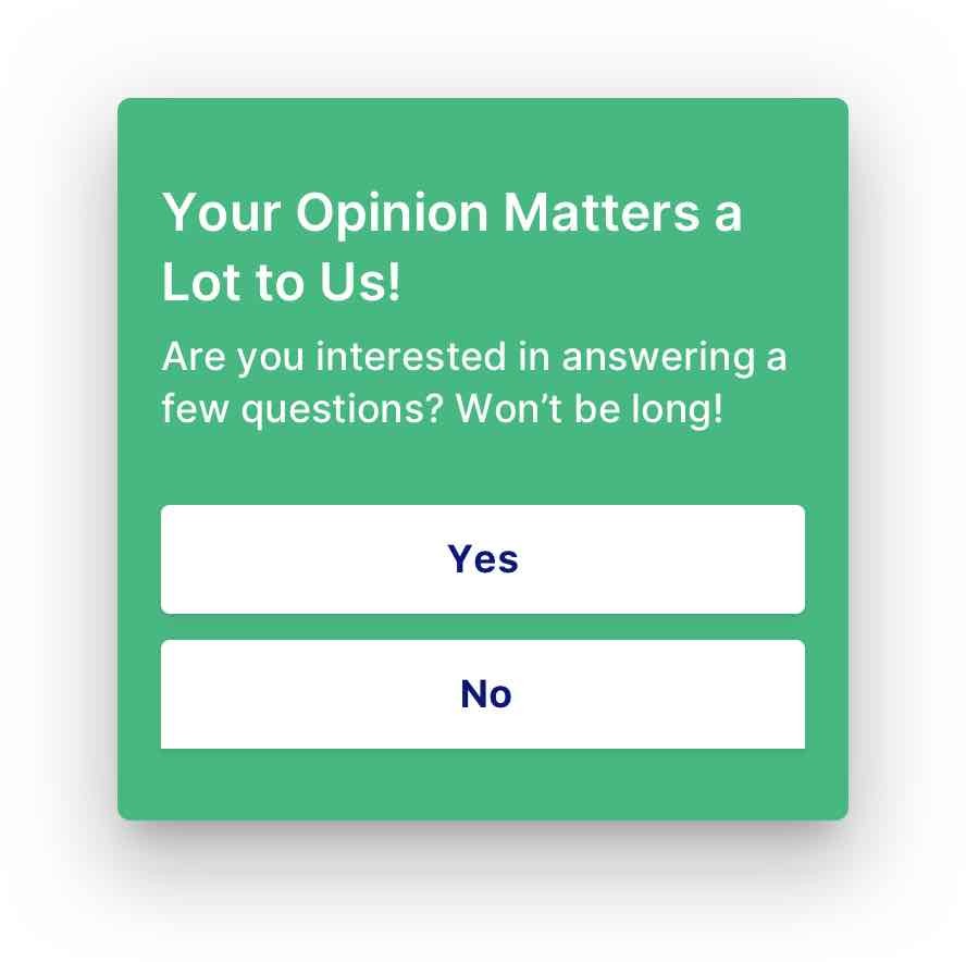
Popup A

Popup B

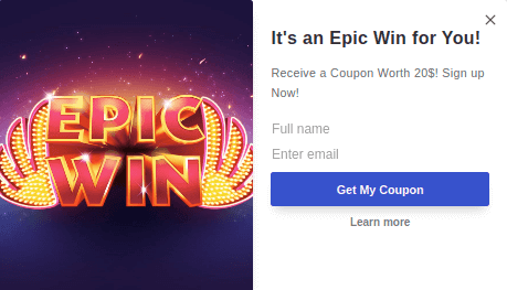
The results were what we expected.
- The “Popup Campaign A” had an astonishing 73% higher conversion rates than the “Popup Campaign B”.
- Also, the average visitors’ duration of the particular page was comparatively higher when the “Popup Campaign A” was live.
This actually means that visitors might have taken a minute or so to look at what the popup form is about (though there are several factors like page traffic, trends and more that could influence the results, we tried our max to keep the results unbiased).
And that’s one classic example as to why you should give undivided attention when it comes to pop-up designs (and why we’ve come up with 20 best popup examples designed by us to help you create better lead capturing forms).
“Displaying popups with good designs is like sending out an ultimate lead capturing machine to hunt”
– Optinly
So, before we get to the part where you could see some of our best pop-up design examples, let’s quickly look into the factors you should take into account when you design a popup form.
4 Factors You Should Remember While Designing a Popup Form
Background Color
That’s the first thing your visitor would notice when a popup form is being displayed (most of the time). Make sure your popup form has a unique background color. Now, unique doesn’t mean you have to opt for frenzy or electrifying background colors. Anything that’s visually appealing would do. We prefer white or mild colors most of the time. Also, make sure that the chosen background color suits your website’s theme.
Popup Form Images
Speaking about images, adding an image to your popup form could be a great way to capture visitors’ attention. But remember, this works out well only if you use it right. Come up with creative images that form a connection with your popup. Put in a few words, your visitors should understand what the website popup is about when they take a look at the image.
Though creating website popups with images is a great way to capture visitors’ attention, it is not mandatory you have to add one every single time – judge the scenario and take relevant decisions.
Typography
Typography is one important factor you should never fail to miss when designing a popup form. Assume your visitor is quite attracted to your popup design. The next thing he gets to see is what the popup says – the popup copy lines (we’ll get to this right after we deal with typography).
Your text should be legible, clear and you shouldn’t have any problem understanding the same. Let’s make this simple,

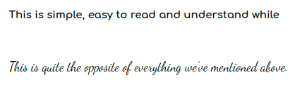
So, make sure you get this right when you create your popup form. Also, make sure that the color of your text is in perfect correlation with your background color/image.
Popup Copy Lines
Capturing your visitor’s attention with your pop-up design is only the first part. Convincing them to take action is a whole different story. Though popup copy lines do not exactly converge with the popup design part, we thought we’d have to explain because it’s one of the things that makes a popup form complete.
Your popup copy lines should be clear, concise and captivating – all at the same time. Seems tough right? Well, if you’re looking forward to some conversions, then there’s no other way. We’ll see about how to write popup copy lines that convert in our upcoming posts.
Now that we’ve covered the basics, let’s look at the 20 best popup examples!
20 Best Popup Design Examples
Exit Intent Popup Design Examples
We couldn’t stress enough how important exit popups are to capture your website visitors at the last moment. Also, exit popups are quite effective when it comes to reducing cart abandonment in your store. Popups with such potential deserved to be designed right. Here are a few best exit popup design examples for you.
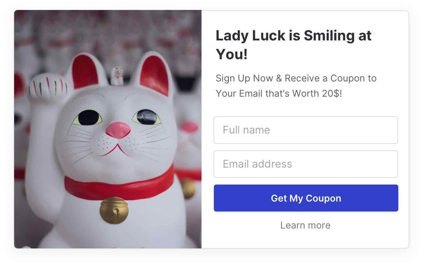
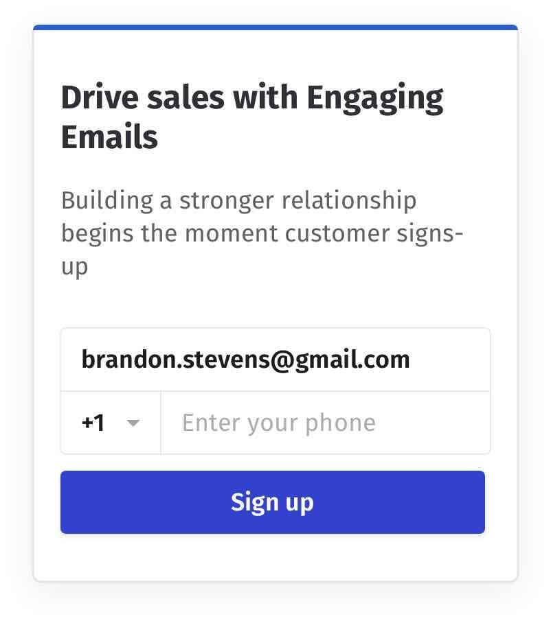
Example 1

A clean, visually appealing exit popup example (the one we used for our experiment above). The image in the popup is a ”lucky cat” which gives visitors a clear picture of what the popup is about. And the text “Lady luck is smiling at you” grabs visitors’ attention without a doubt.
The clean white background and the differentiated call-to-action button make this popup an ideal exit popup design.
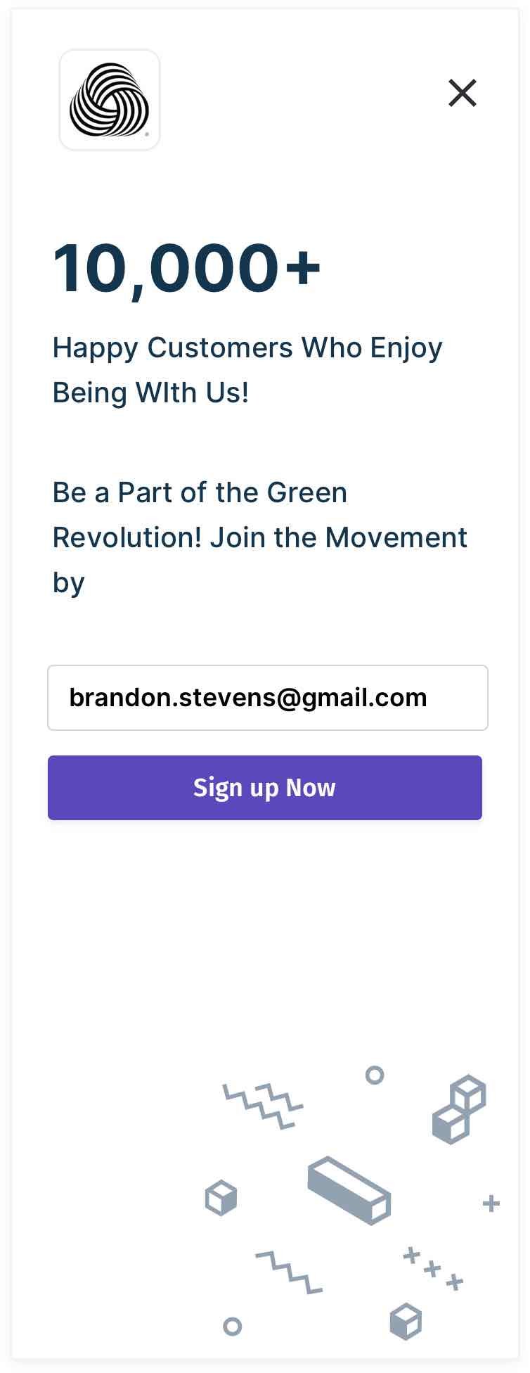
Example 2


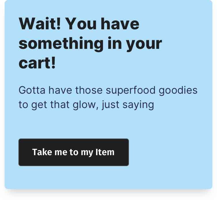
A perfect eCommerce exit-intent popup example – works perfect when used to reduce cart abandonment. The background has a mild pleasing color. The popup copy lines are perfect (to the point) and the pity look on the dog’s face (which I find highly amusing) makes this popup insanely perfect. Also, the call-to-action button is unique and prompts visitors to take immediate action.
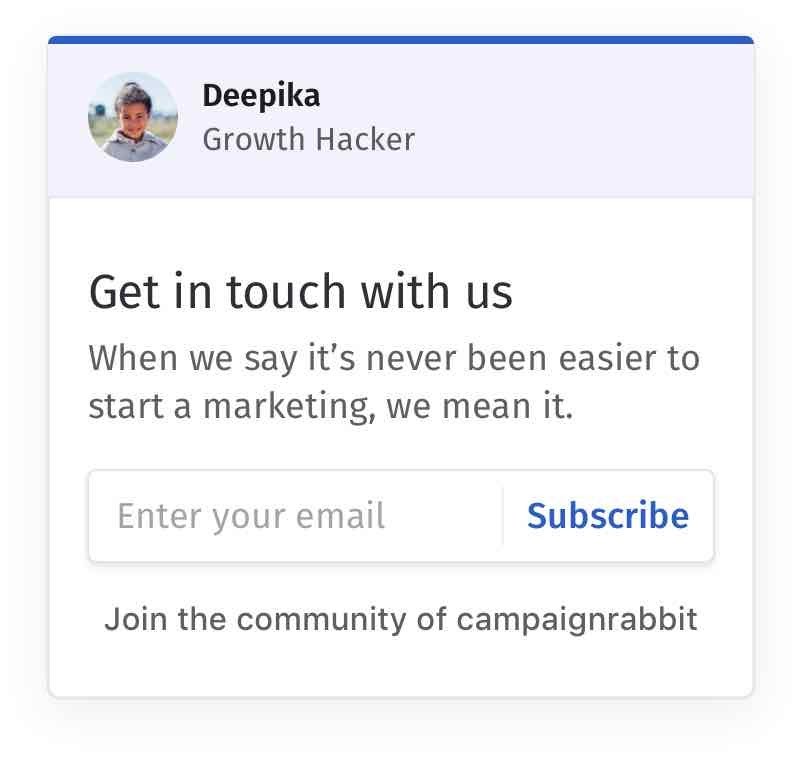
Example 3

Another eCommerce exit popup design but without an image. Like we said above, it’s not mandatory that you have to come up with images every single time. Sometimes, the popup copy lines could do just as much what an image would do.
The above website pop-up example has captivating popup copy lines, not to mention the personalized call-to-action button text. Also, the pleasing background color would be an ideal fit for websites of all colors.
Exit Survey Popup Design Examples
While exit popups are widely being used to reduce cart abandonment and capture visitors at the last moment, they can also be used to collect feedback and valuable information from your website visitors. And exit survey popups help you do just that. Here are a few examples of exit survey popups
Example 1

Example 2

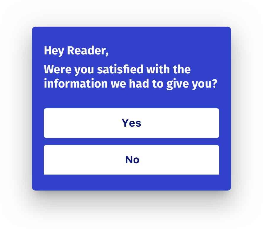
While designing an exit survey popup, you should remember that you are asking your website visitor to do a favor for you. So, it’s important that you keep your popup design at bay and let your visitors read the popup copy lines.
The above exit survey popup is completely genuine and transparent. It’s going to be either this or that choice for your visitors – no brainstorming or hard stuff. The popup copy lines are convincing enough and lets the visitors know how important this is for you – high chances of conversions there!
And that’s how your exit survey popups should be – minimalistic design and convincing copy lines.
Example 3

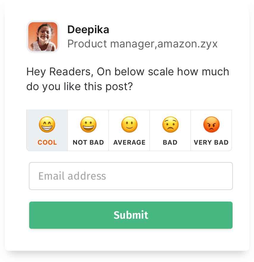
Don’t set boundaries when it comes to website popups. Come up with some creative popup designs at times that’s too hard to resist. We wanted the same for ourselves and came up with one such exit survey popup.
The above popup is custom designed for you to help identify the quality of your posts. And we suppose your readers wouldn’t find it hard to choose from the available emojis! It’s a win-win situation – knowing how your posts are performing and a super cool user experience (don’t worry about the tech part, we’ve taken care of it all for you).
Example 4

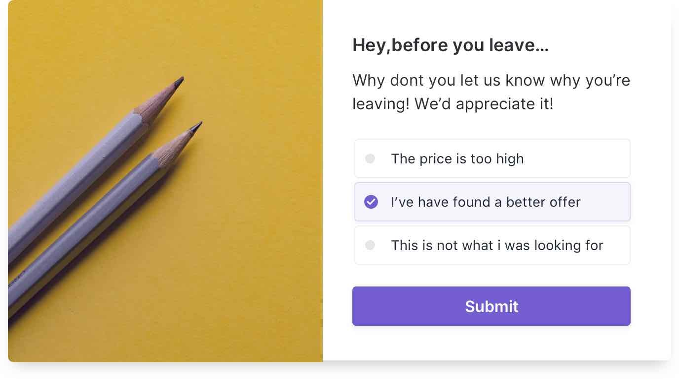
This one’s a two step-optin exit survey popup. What makes this website popup one of the best pop-up design examples is the presence of multiple options to choose from. Your visitors can get it done within seconds and leave your website. And you on the other side will get to understand what went wrong and probably get it fixed the next time – a clean effortless way of getting feedback from your website visitors.
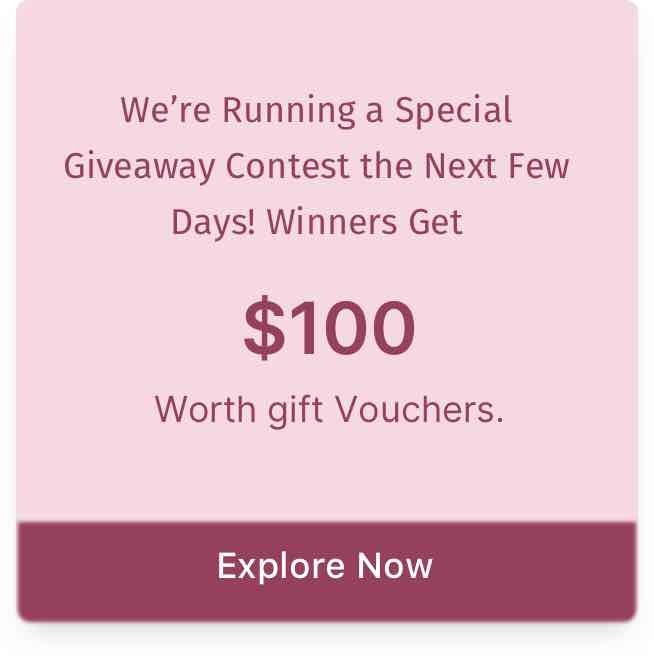
Notification Popup Design Examples
Notification popups are to let your visitors know what’s happening on your website/eCommerce store. When it comes to notification popups, feel free to bring your A-game. The more creative/better design elements your popup has, the higher your conversion rates are going to be. Here are a few notification popup design examples for you
Example 1

Example 2


Example 3

Example 4

Example 5

When designing a notification popup, make sure you remember the popup theme. In the second example, the popup was about anniversary sales for an online apparel store. And the background image was in perfect correlation with the popup theme. As for the other popup examples, they stick to a minimalistic approach, giving more focus to the popup copy lines. Either way, it’s going to work and it is all that matters!
Floating Bar Popup Design Examples
Floating bars optins are one of the most preferred popup forms because of their proven conversion rates and zero annoyance factor. The subtle, less space occupying floating bars puts you through a series of challenges before you get the popup form ready.
It’s because floating bars occupy less screen space and you naturally should try to convey what you want within that. Here are a few floating bar popup design examples.
Example 1


Example 2

Example 3

Example 4

In all the above floating bar popup examples, there’s one thing in common – it’s the background color. The white background helps the content of the floating bar stand out and well noticeable. Also, the popup copy lines in all the floating bar examples are short, to the point and witty at times, not to mention the social proof mentions (10,000+) which is a great way to increase the trust factor and credibility among your website visitors.
Put in a few words, when it comes to floating bar popups, try to give maximum value to your visitors within the minimal space you’ve got.
Gamification Popup Design Examples
Gamification popups are known to take the engagement factor to the next level. And one common gamification popup is spin to win wheel. Spin the wheel popups have become common these days, thanks to the widely available spin to win popup plugins today that has made websites/eCommerce stores make use of this promising website popup. Here are a few examples,
Example 1

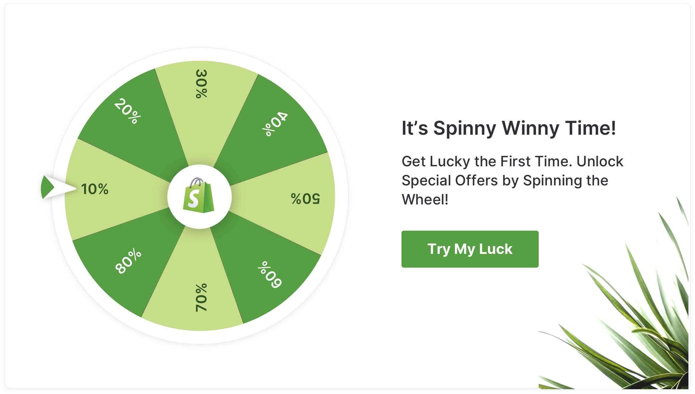
Example 2

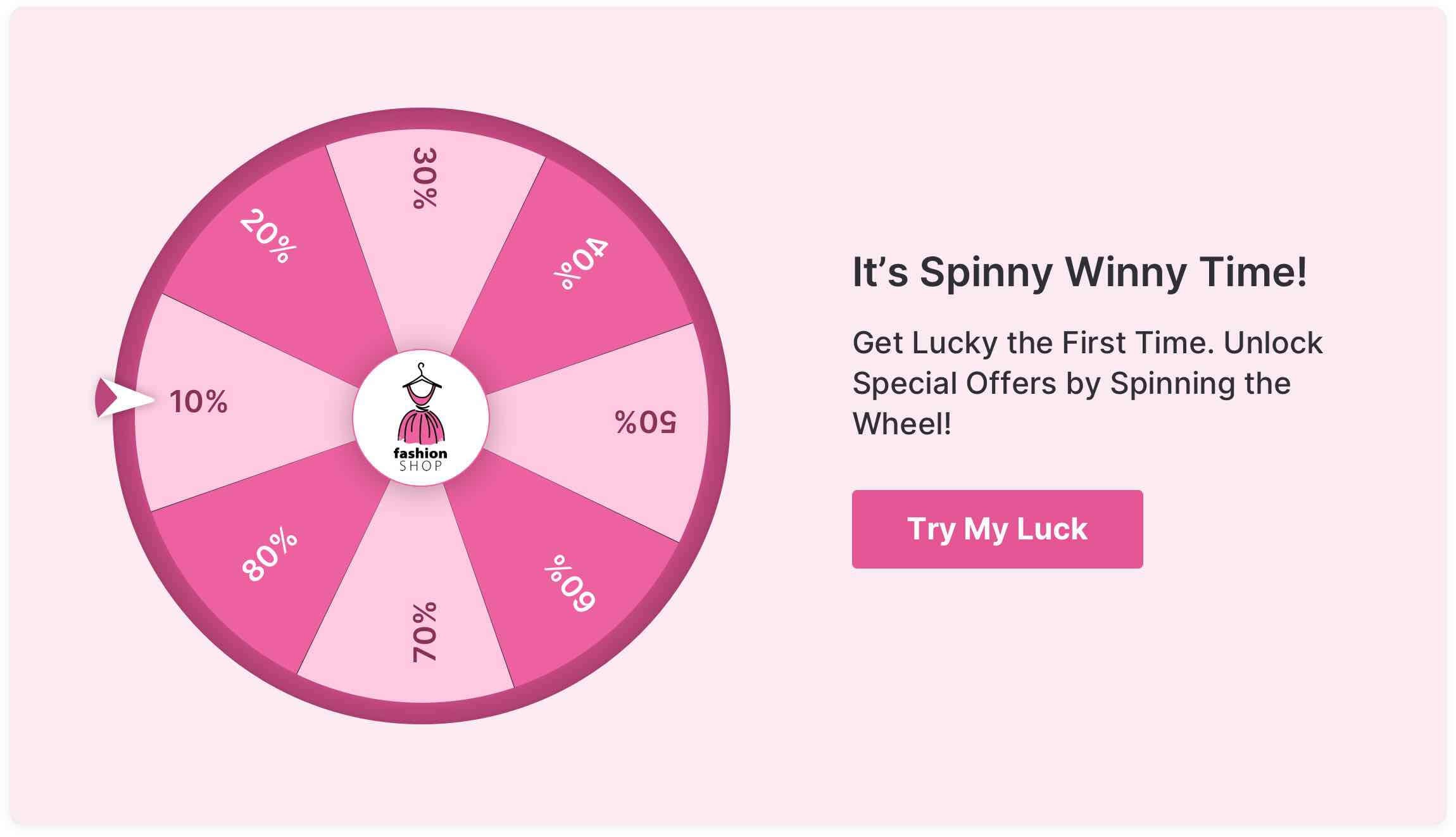
That’s a perfect example of a minimalistic gamification popup design and is best suited for websites/eCommerce stores that love simplicity. Make sure you give enough focus on your spin to win wheel because it’s the element of surprise that’s going to lure your visitors and make them spin it. Optinly’s WYSIWYG editor helps you customize your spin to win wheel exactly the way you want it to look – within minutes!
Coupon Popup Design Examples
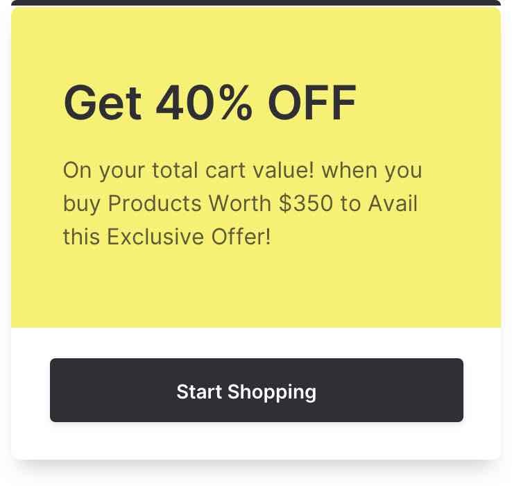
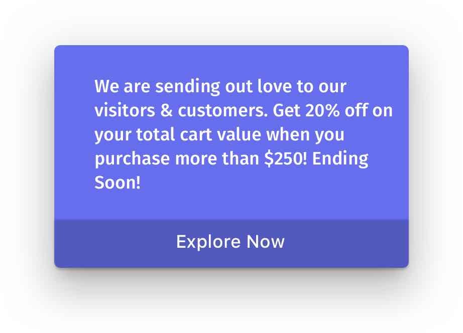
Coupon popups are generally lead capturing forms that work 9 out of 10 times for eCommerce stores. It’s because coupons are irresistible and who would not want a discount when given? Here are a few coupon popup design examples
Example 1


Example 2

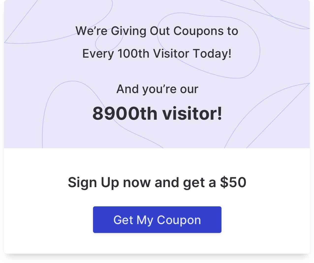
When it comes to coupon popup designs, there are three things you should remember to do without fail,
- Make sure you display the coupon value somewhere within the popup copy/image.
- Your call-to-action button should be unique and captivating
- Try to enhance the personalization factor by using words like “you”
The above coupon popup examples have got all these things right. The word “you” has been used in both the popup examples. Also, the coupon value has displayed, not to mention the unique call-to-action button in both the popup examples.
Wrapping Up…
It’s not enough if you display popups on your website. Your popups should be good enough to grab visitors’ attention and increase conversions. Implementing what you’ve learnt from the above popup examples and knowing how to use popups to grow your business can help you do so. But before you do this, double check what your chosen wordpress popup plugin is capable of. Make sure you have the best responsive WordPress notification plugin on-board to get the best results.
With that said, we’ll come to an end! All that’s left now is for you to start designing your first popup form. Maybe, we’ll add your popup design to our gallery if it’s good enough!
Cheers!